Choosing fonts is easy. Making two fonts work together on a website is where most projects fall apart. Headlines fight body copy, buttons feel off, and the whole page loses its rhythm. For the wider picture, see The Ultimate Guide to Font Pairing.
At Lil Kitty Graphics, we’ve tested hundreds of font combinations across client websites. This guide gives you a repeatable system for pairing fonts, no design degree required. If you can follow 5 rules, you can build a typography system that looks intentional.
Why Font Pairing Matters More Than You Think
Typography accounts for roughly 90% of what visitors read on your site. A bad pairing makes even great content feel amateur. A good pairing creates hierarchy, mood, and trust before a single word is read.
Most articles online will tell you to “just use contrast” or dump 30 pairings on you and wish you luck. That’s not a system. Here’s one that is.
The 5-Rule System for Pairing Fonts on Websites
Rule 1: Start With an Anchor Font
Your anchor font is the one that carries the personality of your brand. It’s usually the headline font. Pick this first, and pick it based on mood, not trend. Anyone digging further should read 10 Best Google Font Pairings for Websites.
- Serif anchors (Playfair Display, Fraunces, DM Serif): editorial, trustworthy, premium
- Sans-serif anchors (Inter, Space Grotesk, Archivo): modern, clean, tech-forward
- Display anchors (Abril Fatface, Bebas Neue): bold, marketing-heavy, statement
Only after the anchor is chosen do you pick a body font to support it.
Rule 2: Match the Body Font to the Job, Not the Vibe
The body font has one job: be readable at 16px on a phone screen. Personality is the anchor’s job. If your body font is too expressive, it competes with the headline and tires the reader.
Safe, high-performance body fonts for websites:
- Inter
- Lato
- Source Sans 3
- Nunito Sans
- IBM Plex Sans
Rule 3: Create Contrast, Not Conflict
Contrast makes a pairing feel intentional. Conflict makes it feel like a mistake. The difference is in which axis you contrast on.
| Contrast Axis | Good Example | Why It Works |
|---|---|---|
| Style (serif + sans) | Playfair Display + Inter | Clear visual role separation |
| Weight | Archivo Black + Archivo Regular | Same family, safe hierarchy |
| Proportion | Bebas Neue (condensed) + Lato (wide) | Visual tension without clash |
Bad contrast example: Two decorative serifs (Playfair + Abril Fatface). Both want to be the star. The page feels loud and unfocused.
Rule 4: Build Hierarchy With Size, Weight, and Space
A pairing isn’t just two fonts. It’s a full type scale. Set these levels before you go live:
- H1: Anchor font, 48 to 64px, bold
- H2: Anchor font, 32 to 40px, semibold
- H3: Anchor or body font, 22 to 26px, semibold
- Body: Body font, 16 to 18px, regular
- Caption / UI: Body font, 13 to 14px, medium
Line height matters too: 1.2 to 1.3 for headings, 1.5 to 1.7 for body. Skip this and even a perfect pairing will look broken. fontshare.com has covered this at length.
Rule 5: Mood Match Before You Commit
The final check: does the pairing feel like the brand? Write down 3 adjectives that describe your website (for example: bold, warm, honest). Look at your pairing and ask if a stranger would use those same words.
If not, change the anchor. Never the body.

Real Font Pairings That Work in 2026
These are combinations we’re actively using in current client projects. All available on Google Fonts.
| Pairing | Best For | Mood |
|---|---|---|
| Fraunces + Inter | SaaS, editorial, agencies | Modern, warm, credible |
| Space Grotesk + IBM Plex Sans | Tech, startups, dev tools | Technical, clean |
| Playfair Display + Source Sans 3 | Luxury, hospitality, coaching | Elegant, established |
| Archivo Black + Archivo | DTC brands, portfolios | Bold, confident |
| DM Serif Display + DM Sans | Blogs, magazines | Balanced, readable |
Font Pairings That Look Bad (and Why)
- Lobster + Pacifico: Two script/display fonts fighting for attention
- Comic Sans + anything: Wrong mood for 99% of professional sites
- Times New Roman + Arial: Reads as “default browser,” no intent shown
- Montserrat + Raleway: Both are geometric sans-serifs, no meaningful contrast
- Bebas Neue + Oswald: Two condensed display fonts, feels claustrophobic
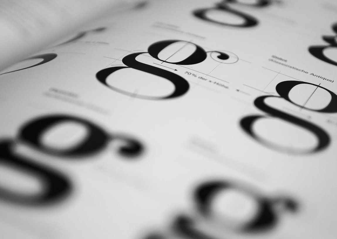
Quick Checklist Before You Ship
- Only 2 font families maximum (3 if one is monospace for code)
- Test at 16px on a real phone, not your desktop preview
- Check all weights load (missing weights kill hierarchy)
- Verify language support if your site is multilingual
- Compress and self-host or use font-display: swap to avoid layout shift
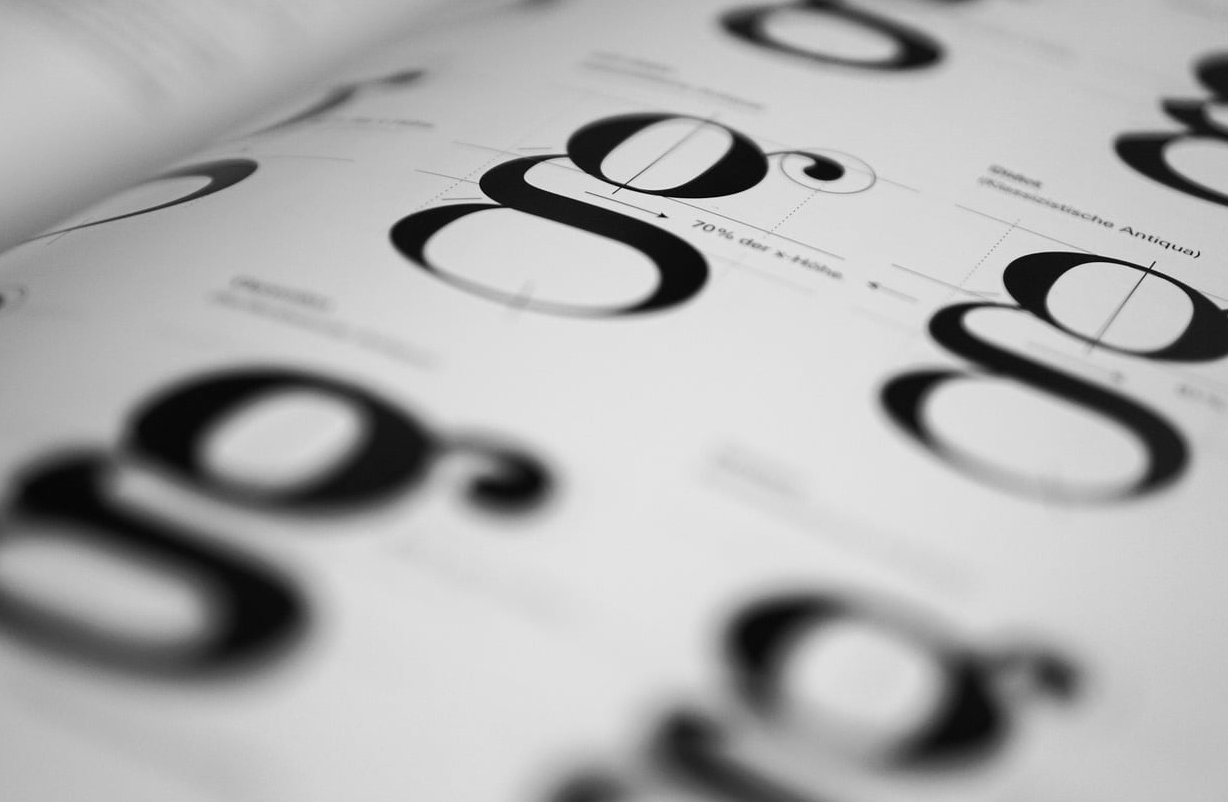
Tools We Actually Use
- Fontpair.co: Fast previews for Google Fonts combinations
- Fontjoy: AI-based suggestions, useful for brainstorming
- Typescale.com: Builds your full type scale in seconds
- Google Fonts “Pairings” tab: Curated suggestions per font
FAQ
How many fonts should a website use?
Two is the sweet spot. One anchor for headlines, one workhorse for body. Add a monospace only if you display code.
Can I pair two serifs or two sans-serifs?
Yes, but only if they contrast strongly in weight or proportion. Two similar sans-serifs (like Montserrat and Poppins) will look like a mistake.
Are Google Fonts good enough for a professional website?
Absolutely. Fonts like Inter, Fraunces, and IBM Plex are used by major brands and cost nothing. Premium fonts only make sense when you need distinct brand ownership.
What’s the safest font pairing for a business website?
Fraunces + Inter, or Playfair Display + Source Sans 3. Both are readable, professional, and versatile across industries.
Should headline and body font come from the same family?
It’s the safest option for beginners. Using one super-family (like Archivo, IBM Plex, or DM) with different weights removes almost all guesswork.
Final Word
Font pairing isn’t magic. It’s a system: pick an anchor for mood, a body for readability, contrast on one clear axis, build a scale, and mood-check the result. Follow those 5 rules and you’ll ship typography that looks like a designer touched it, because now one did.
Need help building a full brand type system for your website? Lil Kitty Graphics designs typography systems that scale across your site, product, and marketing. Get in touch.