
How to Prepare Print-Ready Business Card Files: A Step-by-Step Checklist
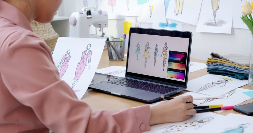
You designed a gorgeous business card, hit “send to printer,” and then got that dreaded email: “Your file has been rejected.” If this has happened to you (or you want to make sure it never does), this guide is for you. At Lil Kitty Graphics, we process print jobs every day, and we see the same handful of file mistakes over and over. This tutorial walks small business owners and beginner designers through exactly how to prepare print files for business cards that pass pre-flight on the first try. Why Print-Ready Files Matter A “print-ready” file is one that requires zero adjustments from the printer before going onto the press. If your file is not print-ready, one of three things will happen: Your job gets delayed while the printer emails you for corrections. You get charged extra for file fixing. The job prints anyway and looks bad (blurry logos, cut-off text, muddy colors). Following the checklist below eliminates all three risks. The Standard Business Card Print Specs (2026) Before you open any software, know your numbers. These are the specs we use at Lil Kitty Graphics and they match industry standards worldwide. Spec Standard (US) Standard (EU) Trim Size 3.5 x 2 in (89 x 51 mm) 85 x 55 mm Bleed 0.125 in on all sides 3 mm on all sides Safe Zone 0.125 in inside trim 3 mm inside trim Resolution 300 DPI 300 DPI Color Mode CMYK CMYK File Format PDF/X-1a or PDF/X-4 PDF/X-1a or PDF/X-4 Understanding Bleed, Trim and Safe Zone These three terms are the source of 80% of file rejections. Here’s a plain-English breakdown: Bleed: The area outside the final card edge. Any background color or image that should touch the edge of the card must extend into this area. This prevents thin white slivers when the card is cut. Trim: The actual cut line. This is the finished size of your card. Safe Zone: The area inside the trim where all critical elements (logo, text, phone number) must live. Cutting machines have a tolerance of about 1 to 2 mm, so anything closer to the edge risks being chopped off. Step-by-Step: How to Prepare Print Files for Business Cards Step 1: Set Up Your Document Correctly Open your design software (Illustrator, InDesign, Photoshop, Affinity, or even Canva Pro) and create a new document with: Set the artboard to the trim size (85 x 55 mm or 3.5 x 2 in). Add 3 mm bleed on all four sides. Set color mode to CMYK. Set resolution to 300 DPI (if raster-based). In Illustrator: File > New, then under “Bleed,” enter 3 mm on all sides. In InDesign: File > New > Document, expand “Bleed and Slug,” set 3 mm. In Photoshop: create a canvas at 91 x 61 mm at 300 DPI (this includes the 3 mm bleed on each side). Step 2: Design Within the Safe Zone Draw guides 3 mm inside the trim on all sides. Nothing important goes past those guides. That includes: Your logo Name and title Phone number, email, website Social media handles Any icons or QR codes Background colors, patterns, and full-bleed photos should extend all the way to the bleed edge. Step 3: Convert All Colors to CMYK RGB is for screens. CMYK is for print. If you send RGB, your printer will convert it, and the colors will shift, usually toward duller and darker tones. For deep, rich blacks (like large backgrounds), use a rich black mix: C:60 M:40 Y:40 K:100 instead of straight K:100, which prints as a muddy grey. Step 4: Check Image Resolution Every raster image (photo, texture, JPG logo) must be 300 DPI at final size. A logo pulled from a website is usually 72 DPI and will print blurry. Always request vector logos (.ai, .eps, or .svg) from your client or brand. Step 5: Outline Your Fonts If the printer does not have your font installed, your file will render with a default substitute. To prevent this, convert text to outlines: Illustrator: Select all (Cmd/Ctrl + A), then Type > Create Outlines (Cmd/Ctrl + Shift + O). InDesign: Select text, Type > Create Outlines. Affinity Designer: Select text, Layer > Convert to Curves. Tip: Save a copy of your file before outlining, so you can still edit the text later. Step 6: Export as Print-Ready PDF PDF is the industry-standard print format. Here’s the export recipe: Go to File > Export (or Save As in Illustrator). Choose Adobe PDF (Print). Select the preset PDF/X-1a:2001 or PDF/X-4. Under “Marks and Bleeds,” check Crop Marks and Use Document Bleed Settings. Under “Output,” confirm color conversion is set to No Color Conversion or Convert to CMYK. Export. What Does a Print-Ready File Actually Look Like? A finished, correctly-exported PDF for an 85 x 55 mm business card will show: A total page size of 91 x 61 mm (trim + bleed on both sides). Crop marks in the corners indicating the trim line. Background color or image extending all the way to the outer edge of the bleed area. All text and logos comfortably inside the 3 mm safe zone. Two pages if double-sided: page 1 is the front, page 2 is the back, both same orientation. The 7 Most Common Reasons Printers Reject Business Card Files No bleed: The file is exactly 85 x 55 mm with no extension. Result: white slivers on the edge after cutting. Wrong color mode: File is in RGB. Result: color shift on press. Low resolution: Images below 300 DPI. Result: blurry or pixelated print. Live text with unavailable fonts: Fonts not outlined or embedded. Result: default font substitution. Text too close to the edge: Elements outside the safe zone. Result: information gets trimmed off. Wrong file format: JPG or PNG submitted for high-quality print jobs. Result: compression artifacts and no bleed support. Mismatched orientation between sides: Front is landscape, back is portrait. Result: back prints upside down. PNG vs PDF: Which Is Better for Business Card
How to Redesign a Logo Without Losing Brand Recognition: 7 Practical Rules

How to Redesign a Logo Without Losing Brand Recognition Your logo is one of your most valuable business assets. It carries years of customer memory, trust, and visual equity. So when it starts to feel dated, the question is rarely should we redesign it? but rather how do we redesign it without erasing everything our audience already recognizes? At Lil Kitty Graphics, we have helped dozens of brands modernize their identity without alienating loyal customers. Below is the practical, step-by-step framework we use. No theory, just the rules that work. Why a Bad Redesign Can Hurt Your Brand When Gap tried to replace its iconic blue square logo in 2010, customer backlash forced the brand to revert in less than a week. More recently, brands like Jaguar in 2024 sparked massive debate by stripping away decades of equity overnight. The lesson is simple: brand recognition is built over years and can be destroyed in a single launch. A successful logo redesign should feel less like a revolution and more like a haircut. Refreshed, modern, but still unmistakably you. The 7 Practical Rules to Redesign a Logo Without Losing Brand Recognition 1. Audit Your Existing Visual Equity First Before touching anything, list what your customers actually recognize. This is your visual equity inventory. Dominant color (or color pair) Shape of the mark (circle, shield, wordmark) Iconic symbol or character Letter proportions and spacing Tagline placement If you ask 10 customers to sketch your logo from memory, what do they always draw? That element is sacred. Keep it. 2. Keep the Core Color Palette (or Evolve It Slowly) Color is the fastest brand identifier. Studies suggest color increases brand recognition by up to 80%. When refreshing, you have three safe options: Approach What It Means Risk Level Keep identical Same hex codes, no change Very low Modernize tone Same hue, adjusted saturation or brightness Low Add accent colors Core stays, secondary palette expands Medium Avoid switching from warm to cool tones in a single iteration. Coca-Cola red has remained Coca-Cola red for over a century for good reason. 3. Preserve the Silhouette and Proportions The outline of your logo is what customers spot from across a parking lot or in a tiny app icon. If your mark is horizontal, do not suddenly make it vertical. If your symbol is round, do not square it off. Examples of brands that nailed this: Burger King (2021): Returned to the 1969 silhouette, just cleaned up. Instantly familiar, dramatically more modern. Pepsi (2023): Brought back the bold wordmark inside the iconic globe shape. Same proportions, refreshed execution. Nokia (2023): Updated the typeface but kept the recognizable letter rhythm. 4. Refresh the Typography, Do Not Replace It Typography is where you can safely modernize without losing recognition. The trick is to keep the same character: if your current font is geometric and bold, your new one should be too, just cleaner and better optimized for screens. What you can safely update: Letter spacing (kerning) for better digital readability Replacing dated quirks like overly exaggerated serifs Improving thin strokes that disappear on mobile Custom letter adjustments for personality 5. Simplify, Do Not Strip Modern design favors flat, scalable, and minimal marks. But there is a difference between simplifying (removing gradients, drop shadows, and noisy details) and stripping (removing the personality that made you recognizable in the first place). Ask yourself before deleting any element: If we remove this, will a loyal customer still feel something familiar? If the answer is no, put it back. 6. Test With Real Customers Before Launching This is the step most brands skip and later regret. Before approving the final version: Show the new logo alongside the old one to 20 to 50 existing customers Ask: “Is this still our brand?” (yes/no) Ask: “Does this feel more modern?” (yes/no) Aim for 90%+ on the first question and 70%+ on the second If recognition drops below 80%, you have gone too far. Pull it back. 7. Roll Out Gradually, Not Overnight A sudden swap shocks customers. A phased rollout builds anticipation and lets people adjust. Phase 1: Internal teams, email signatures, business cards Phase 2: Website and social profiles, with a short “we have refreshed our look” announcement Phase 3: Packaging, signage, and physical assets as inventory rotates This approach also gives you time to monitor customer sentiment and pivot if needed. Logo Refresh vs Full Rebrand: Which One Do You Need? Situation Recommended Action Logo feels dated but business is healthy Refresh New target audience or new market Refresh + repositioning Company name change or merger Full rebrand Reputation damage to repair Full rebrand Logo does not work digitally Refresh Common Mistakes to Avoid Chasing trends: The flat minimalist wave already triggered a backlash in 2024 and 2025. Design for the next decade, not next quarter. Designing in isolation: If only the CEO and the designer see it before launch, you are gambling. Removing the mascot or symbol: Characters carry massive emotional equity. Modernize them, do not delete them. Forgetting digital scalability: Test at 16px (favicon size) before approving anything. Ignoring the legacy version: Archive it. Some brands successfully bring it back later (see Burger King). Final Thoughts The best logo redesigns feel inevitable in hindsight. Customers should look at the new version and think “of course, it was always meant to look like this.” That feeling only happens when you respect the equity you have built and refresh with intention, not ego. If you are planning a logo refresh in 2026 and want a partner who values recognition as much as creativity, the team at Lil Kitty Graphics would love to help. Reach out for a free brand audit. FAQ How often should a company redesign its logo? Most successful brands refresh their logo every 7 to 10 years. A full overhaul is rarely needed more than once every 15 to 20 years unless the business undergoes major changes. Will a logo redesign hurt my SEO or brand searches? The logo
Wordmark vs Lettermark Logo: Key Differences and How to Choose
Wordmark vs Lettermark: Two Text-Based Logos, Two Different Strategies Choosing between a wordmark and a lettermark is one of the first big decisions small business owners face when building a brand identity. Both are text-only logos, both can look incredibly polished, but they serve very different purposes. Pick the wrong one and you might end up with a logo that’s hard to read, hard to remember, or simply doesn’t fit on your packaging. At Lil Kitty Graphics, we’ve designed hundreds of logos for startups, shops, and service businesses. In this guide, we’ll break down the real differences between wordmarks and lettermarks, show you brand examples you already know, and help you decide which style truly fits your business in 2026. What Is a Wordmark Logo? A wordmark (sometimes called a logotype) is a logo built entirely from the full business name, styled with a custom or carefully chosen typeface. There’s no icon, no symbol, no initials. The word itself is the logo. Famous wordmark examples include: Google – colorful, friendly, sans-serif Coca-Cola – flowing, vintage script Visa – bold, confident, blue and gold Disney – playful, custom hand-drawn lettering FedEx – clean sans-serif with a hidden arrow What makes a wordmark powerful is that it teaches people your brand name every single time they see your logo. There’s no guessing, no decoding. What Is a Lettermark Logo? A lettermark (also called a monogram logo) uses just the initials of the business, usually two to four letters. It’s a smart shortcut for brands with long, complex, or multi-word names. Famous lettermark examples include: HBO – Home Box Office IBM – International Business Machines NASA – National Aeronautics and Space Administration CNN – Cable News Network HP – Hewlett-Packard Notice a pattern? These brands all have names that would be a mouthful as full wordmarks. Lettermarks compress them into something instantly recognizable. Wordmark vs Lettermark: The Key Differences Feature Wordmark Lettermark Best name length Short, 1 to 2 words Long or multi-word names Brand recognition Builds name awareness fast Requires more time to teach Scalability Can be tricky on small items Excellent on tiny surfaces Personality Custom, expressive typography Compact, often corporate Versatility Strong on signage and packaging Strong on apps, favicons, merch Best for New brands, fashion, food, lifestyle Corporate, tech, finance, media When a Wordmark Is the Right Choice A wordmark works best when your business name is one of your strongest marketing assets. If people can say it, spell it, and remember it easily, you want it in their face. Choose a wordmark if: Your brand name is short (typically under 10 characters) Your name is unique or invented, like Spotify or Uber You’re a new business still building name recognition You operate in a visual industry like fashion, beauty, food, or hospitality You want your typography to communicate personality directly When a Lettermark Is the Right Choice A lettermark earns its keep when your full name is too long, too descriptive, or too generic to work as a logo. Initials create breathing room and make the brand feel iconic. Choose a lettermark if: Your business name has three or more words Your name is hard to pronounce or spell You need a logo that scales down to app icons, social avatars, or product tags You operate in B2B, finance, law, or tech where authority matters You already have name recognition and want a sleeker mark Real-World Decision Examples Example 1: A new bakery called “Sunny” Short, warm, memorable. A wordmark with custom rounded lettering will sell the personality instantly. A lettermark of just “S” would waste the name’s charm. Example 2: A consulting firm called “Brighton Marshall Consulting Group” Way too long for a wordmark on a business card. A lettermark like BMCG or BM is far more practical and looks executive-level. Example 3: A streetwear label called “Kiko” Four letters, punchy sound. A wordmark wins. The name is the brand. Example 4: A digital agency called “North & Pine Digital” Could go either way. A wordmark works for the website header, but a lettermark like “N&P” or “NP” is gold for app icons and merch. Common Mistakes to Avoid Forcing a wordmark on a long name – it shrinks into illegibility on packaging Using a lettermark for an unknown brand – nobody knows what “BTC Studio” stands for yet Picking a generic font – both wordmarks and lettermarks need custom or refined typography Ignoring scalability – always test your logo at favicon size and billboard size Skipping a backup version – many brands wisely use a wordmark and a lettermark together as a logo system Can You Use Both? Yes, and You Probably Should Most modern brands maintain a logo system: a primary wordmark for full-size applications and a lettermark variant for compact spaces. Think of how Netflix uses “NETFLIX” as a wordmark on signage but a stylized “N” as the app icon. Mastercard, Adobe, and Airbnb all do the same. If your budget allows, ask your designer for both versions during the initial brand identity project. It’s much cheaper than coming back later. Final Verdict: Which One Should You Pick? Here’s the simplest decision tree: Name is 1 to 2 short words ? Go with a wordmark Name is 3+ words or hard to read ? Go with a lettermark You’re a brand-new business ? Lean wordmark to build recognition You’re established or B2B ? Lettermark gives instant authority You can afford it ? Get both as part of a logo system FAQ: Wordmark vs Lettermark What is the difference between a lettermark and a wordmark? A wordmark uses the full business name as the logo, while a lettermark uses only the initials. Wordmarks emphasize the brand name; lettermarks emphasize compactness and recognition through abbreviation. Is a wordmark better than a lettermark? Neither is universally better. A wordmark is better for short, memorable names and new brands. A lettermark is better for long names, established companies, and small-format applications like apps and favicons. Can a
Logo File Formats Explained: PNG, SVG, EPS, PDF and When to Use Each

Logo File Formats Explained: Why It Matters More Than You Think You just received your brand-new logo from your designer. You open the folder and find a collection of files with extensions like .PNG, .SVG, .EPS, .PDF, .AI, and .JPG. Your first thought? “Which one do I actually use?” You are not alone. This is one of the most common questions business owners ask after a logo design project. Using the wrong file format can result in blurry logos on your website, pixelated images on banners, or printers rejecting your files entirely. This guide breaks down every logo file format in plain, non-designer language. By the end, you will know exactly which file to grab for any situation, whether it is your website, a business card, a social media profile, or a t-shirt. Two Categories You Need to Understand First: Vector vs. Raster Before we dive into individual formats, you need to understand the difference between vector and raster files. This is the single most important concept in logo file formats. Vector Files Built using mathematical points, lines, and curves. Can be scaled to any size without losing quality. A billboard or a pen? Same sharpness. Common vector formats: SVG, EPS, AI, PDF Raster Files Made up of tiny squares called pixels. Have a fixed resolution. If you enlarge them beyond their original size, they become blurry and pixelated. Common raster formats: PNG, JPG/JPEG The golden rule: Always use a vector file when you can. Only use raster files when the platform or situation specifically requires them (like uploading to a website or social media). Every Logo File Format Explained Let’s go through each format one by one. For every format, we will cover what it is, when to use it, and when to avoid it. 1. PNG (Portable Network Graphics) Type: Raster Supports transparency: Yes PNG is probably the format you will use most often in your day-to-day business life. It supports transparent backgrounds, which means your logo can sit cleanly on top of any color or image without an ugly white box around it. When to use PNG: Website headers and footers Social media profile pictures and posts Email signatures Presentations (PowerPoint, Google Slides) Any digital use where you need a transparent background When NOT to use PNG: Large-format printing (banners, billboards) because it will pixelate Sending to a printer who asks for vector files Pro tip: Make sure your designer provides PNG files in multiple sizes. A 500px wide PNG is great for a website, but too small for a presentation slide background. 2. SVG (Scalable Vector Graphics) Type: Vector Supports transparency: Yes SVG is a vector format designed specifically for the web. Because it is vector-based, your logo stays perfectly crisp on any screen, whether someone is viewing it on a phone, tablet, or a 4K monitor. When to use SVG: Your website (it loads fast and looks sharp on all devices) Web applications and digital platforms Animated logos on websites Favicon creation When NOT to use SVG: Print projects (printers typically do not accept SVG) Social media uploads (platforms like Instagram and Facebook do not support SVG) 3. EPS (Encapsulated PostScript) Type: Vector Supports transparency: Yes EPS is a professional-grade vector format that has been an industry standard for decades. It is the format that print shops, sign makers, and merchandise producers most commonly request. When to use EPS: Professional printing (business cards, brochures, flyers) Large-format printing (banners, trade show displays, vehicle wraps) Merchandise production (t-shirts, mugs, pens, embroidery) Sending your logo to another designer or agency When NOT to use EPS: Uploading to websites or social media (browsers cannot display EPS files) Email attachments to people who do not have design software Pro tip: You cannot open an EPS file with a basic image viewer. You need software like Adobe Illustrator, CorelDRAW, or a free alternative like Inkscape. 4. PDF (Portable Document Format) Type: Can be vector or raster (depending on how it was created) Supports transparency: Yes PDF is the most versatile logo file format. Almost everyone can open a PDF, and when your designer saves your logo as a vector PDF, it retains all the scalability benefits of a vector file. When to use PDF: Sending your logo to a printer (widely accepted) Sharing your logo with anyone who does not have design software Print-ready documents and packaging Brand guideline documents When NOT to use PDF: Uploading directly to websites (use SVG or PNG instead) Social media profile images PDF is often the safest option when you are unsure what format someone needs. If your printer or vendor does not specify a format, send the PDF. 5. AI (Adobe Illustrator) Type: Vector Supports transparency: Yes The AI file is the original source file of your logo. Think of it as the master copy. It contains all the layers, editable text, and design elements your designer used to create your logo. When to use AI: When another designer or agency needs to edit or modify your logo Future rebranding or logo updates Creating new marketing materials based on your logo When NOT to use AI: Everyday use. This is your backup file, not your everyday file. Sending to printers (send EPS or PDF instead, unless they specifically ask for AI) Important: Always make sure you receive the AI file (or equivalent source file) from your designer. Store it safely. If you ever need to work with a new designer in the future, this file is essential. 6. JPG / JPEG (Joint Photographic Experts Group) Type: Raster Supports transparency: No JPG is the most common image format in the world, but it is actually the least ideal format for logos. It does not support transparent backgrounds, so your logo will always have a white (or colored) rectangle behind it. JPG also uses compression that reduces image quality. When to use JPG: When a platform or form specifically requires JPG Quick email attachments when image quality is not critical Document embedding where transparency is
Web Design for Chiropractors: How to Attract More Patients Online
Why Web Design for Chiropractors Is Different From Other Industries If you run a chiropractic practice, your website is not just a digital business card. It is your most powerful tool for attracting new patients, building trust before they ever walk through your door, and filling your appointment calendar around the clock. But here is the thing: web design for chiropractors comes with unique challenges that generic website templates simply cannot address. Patients searching for a chiropractor are often in pain, skeptical about treatment, and comparing multiple providers at the same time. Your website needs to answer their questions, calm their fears, and make booking an appointment effortless. In this guide, we break down the specific website features, design elements, and local SEO strategies that chiropractic practices need to convert visitors into loyal patients. Whether you are building a new site or redesigning an existing one, this post will give you a clear roadmap for 2026 and beyond. What Patients Are Really Looking for on a Chiropractic Website Before we dive into design specifics, it helps to understand the mindset of someone searching for a chiropractor online. Most prospective patients fall into one of these categories: Pain seekers: They have back pain, neck pain, or headaches and want relief fast. Referral validators: A friend or doctor recommended your practice, and they are checking you out online before committing. Insurance shoppers: They want to know if you accept their insurance before they invest any more time. Skeptics: They have never been to a chiropractor and need reassurance that it is safe and effective. Your website design must speak to all four of these groups simultaneously. That means clear messaging, visible trust signals, easy navigation, and a frictionless path to booking. 10 Essential Web Design Features Every Chiropractic Website Needs Let us walk through the features that separate high-converting chiropractic websites from the ones that simply sit there collecting dust. 1. Online Appointment Booking Integration This is the single most important conversion feature on any chiropractic website in 2026. If a patient has to call your office to schedule an appointment, you will lose a significant percentage of potential bookings, especially after hours and on weekends. What to look for in a booking system: Real-time availability display Integration with your practice management software (like ChiroTouch, Jane App, or EHR systems) Automated confirmation emails and SMS reminders Mobile-friendly booking flow Option for new patient intake forms to be completed online before the visit Place your “Book Now” button in the header of every page, not just the homepage. It should be visible without scrolling on both desktop and mobile devices. 2. Patient Trust Signals Above the Fold Healthcare is a trust-based industry. Within the first three seconds of landing on your site, visitors need to see credibility indicators that tell them they are in good hands. Effective trust signals for chiropractors include: Doctor credentials and certifications (DC, DACBSP, etc.) Years of experience or number of patients treated Google review rating with star display Professional association badges (ACA, ICA, state associations) “As seen in” media mentions if applicable Real photos of the doctor and the clinic (not stock images) Stock photos of generic smiling people in lab coats actually damage trust for healthcare providers. Invest in professional photography of your actual office, staff, and treatment rooms. 3. Mobile-First Responsive Design Over 70% of local healthcare searches now happen on mobile devices. If your chiropractic website is not optimized for smartphones, you are invisible to the majority of potential patients. Mobile design priorities for chiropractors: Click-to-call phone number in the header Thumb-friendly navigation menus Fast loading times (under 3 seconds) Booking buttons that are easy to tap Maps and directions that open directly in the phone’s navigation app 4. Service Pages With Clear Descriptions Do not lump all your services onto a single page. Each treatment or condition you address deserves its own dedicated page. This is important for both patient education and SEO. Create individual pages for: Spinal adjustments Sports injury treatment Sciatica relief Prenatal chiropractic care Pediatric chiropractic Auto accident injury treatment Headache and migraine relief Posture correction Each page should explain what the treatment involves, who it is for, what results patients can expect, and include a call to action to book an appointment. 5. Patient Testimonials and Reviews Social proof is one of the most powerful conversion tools in healthcare web design. Prospective patients want to hear from real people who had similar problems and found relief at your practice. Best practices for displaying testimonials: Use video testimonials whenever possible (they convert significantly better than text) Include the patient’s first name, photo, and the condition that was treated Embed your Google Reviews feed directly on your website Feature testimonials on your homepage, service pages, and a dedicated reviews page Keep testimonials HIPAA-compliant by obtaining written consent 6. Doctor Bio Page That Builds Connection Your “About the Doctor” page is typically one of the most visited pages on a chiropractic website. Patients want to know who will be treating them before they commit. Your bio page should include: Professional headshot and candid photos Education and certifications Your chiropractic philosophy and approach to care Personal details that humanize you (family, hobbies, community involvement) A short video introduction if possible 7. New Patient Information Section Reduce friction for first-time visitors by creating a dedicated “New Patients” section on your website. This page should answer every question a new patient might have before their first visit. Information to Include Why It Matters What to expect at your first visit Reduces anxiety for first-time chiropractic patients Insurance plans accepted Eliminates a top reason patients abandon the booking process Downloadable intake forms Saves time at the office and improves patient experience Office hours and location with map Makes it easy for patients to plan their visit Pricing or payment plan information Builds transparency and trust, especially for uninsured patients Cancellation and no-show policy Sets expectations and reduces missed appointments 8. HIPAA-Compliant Contact Forms Any form on

