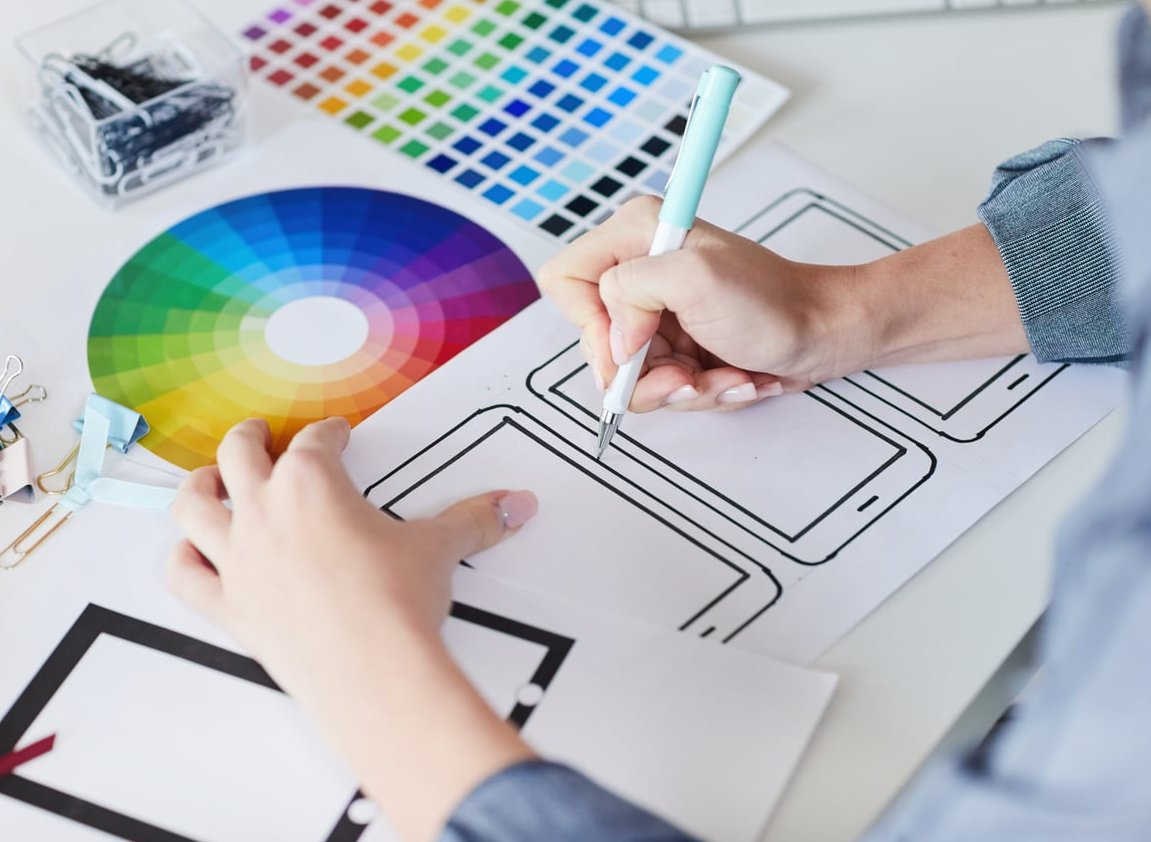
How to Redesign a Logo Without Losing Brand Recognition
Your logo is one of your most valuable business assets. It carries years of customer memory, trust, and visual equity. So when it starts to feel dated, the question is rarely should we redesign it? but rather how do we redesign it without erasing everything our audience already recognizes?
At Lil Kitty Graphics, we have helped dozens of brands modernize their identity without alienating loyal customers. Below is the practical, step-by-step framework we use. No theory, just the rules that work.

Why a Bad Redesign Can Hurt Your Brand
When Gap tried to replace its iconic blue square logo in 2010, customer backlash forced the brand to revert in less than a week. More recently, brands like Jaguar in 2024 sparked massive debate by stripping away decades of equity overnight. The lesson is simple: brand recognition is built over years and can be destroyed in a single launch.
A successful logo redesign should feel less like a revolution and more like a haircut. Refreshed, modern, but still unmistakably you.
The 7 Practical Rules to Redesign a Logo Without Losing Brand Recognition
1. Audit Your Existing Visual Equity First
Before touching anything, list what your customers actually recognize. This is your visual equity inventory.
- Dominant color (or color pair)
- Shape of the mark (circle, shield, wordmark)
- Iconic symbol or character
- Letter proportions and spacing
- Tagline placement
If you ask 10 customers to sketch your logo from memory, what do they always draw? That element is sacred. Keep it.
2. Keep the Core Color Palette (or Evolve It Slowly)
Color is the fastest brand identifier. Studies suggest color increases brand recognition by up to 80%. When refreshing, you have three safe options:
| Approach | What It Means | Risk Level |
|---|---|---|
| Keep identical | Same hex codes, no change | Very low |
| Modernize tone | Same hue, adjusted saturation or brightness | Low |
| Add accent colors | Core stays, secondary palette expands | Medium |
Avoid switching from warm to cool tones in a single iteration. Coca-Cola red has remained Coca-Cola red for over a century for good reason.
3. Preserve the Silhouette and Proportions
The outline of your logo is what customers spot from across a parking lot or in a tiny app icon. If your mark is horizontal, do not suddenly make it vertical. If your symbol is round, do not square it off.
Examples of brands that nailed this:
- Burger King (2021): Returned to the 1969 silhouette, just cleaned up. Instantly familiar, dramatically more modern.
- Pepsi (2023): Brought back the bold wordmark inside the iconic globe shape. Same proportions, refreshed execution.
- Nokia (2023): Updated the typeface but kept the recognizable letter rhythm.
4. Refresh the Typography, Do Not Replace It
Typography is where you can safely modernize without losing recognition. The trick is to keep the same character: if your current font is geometric and bold, your new one should be too, just cleaner and better optimized for screens.
What you can safely update:
- Letter spacing (kerning) for better digital readability
- Replacing dated quirks like overly exaggerated serifs
- Improving thin strokes that disappear on mobile
- Custom letter adjustments for personality
5. Simplify, Do Not Strip
Modern design favors flat, scalable, and minimal marks. But there is a difference between simplifying (removing gradients, drop shadows, and noisy details) and stripping (removing the personality that made you recognizable in the first place).
Ask yourself before deleting any element: If we remove this, will a loyal customer still feel something familiar? If the answer is no, put it back.
6. Test With Real Customers Before Launching
This is the step most brands skip and later regret. Before approving the final version:
- Show the new logo alongside the old one to 20 to 50 existing customers
- Ask: “Is this still our brand?” (yes/no)
- Ask: “Does this feel more modern?” (yes/no)
- Aim for 90%+ on the first question and 70%+ on the second
If recognition drops below 80%, you have gone too far. Pull it back.
7. Roll Out Gradually, Not Overnight
A sudden swap shocks customers. A phased rollout builds anticipation and lets people adjust.
- Phase 1: Internal teams, email signatures, business cards
- Phase 2: Website and social profiles, with a short “we have refreshed our look” announcement
- Phase 3: Packaging, signage, and physical assets as inventory rotates
This approach also gives you time to monitor customer sentiment and pivot if needed.
Logo Refresh vs Full Rebrand: Which One Do You Need?
| Situation | Recommended Action |
|---|---|
| Logo feels dated but business is healthy | Refresh |
| New target audience or new market | Refresh + repositioning |
| Company name change or merger | Full rebrand |
| Reputation damage to repair | Full rebrand |
| Logo does not work digitally | Refresh |
Common Mistakes to Avoid
- Chasing trends: The flat minimalist wave already triggered a backlash in 2024 and 2025. Design for the next decade, not next quarter.
- Designing in isolation: If only the CEO and the designer see it before launch, you are gambling.
- Removing the mascot or symbol: Characters carry massive emotional equity. Modernize them, do not delete them.
- Forgetting digital scalability: Test at 16px (favicon size) before approving anything.
- Ignoring the legacy version: Archive it. Some brands successfully bring it back later (see Burger King).
Final Thoughts
The best logo redesigns feel inevitable in hindsight. Customers should look at the new version and think “of course, it was always meant to look like this.” That feeling only happens when you respect the equity you have built and refresh with intention, not ego.
If you are planning a logo refresh in 2026 and want a partner who values recognition as much as creativity, the team at Lil Kitty Graphics would love to help. Reach out for a free brand audit.
FAQ
How often should a company redesign its logo?
Most successful brands refresh their logo every 7 to 10 years. A full overhaul is rarely needed more than once every 15 to 20 years unless the business undergoes major changes.
Will a logo redesign hurt my SEO or brand searches?
The logo itself does not impact SEO directly, but if customers no longer recognize your brand visually, branded search volume can drop. This is why phased rollouts and visual continuity matter.
What is the difference between a logo refresh and a rebrand?
A refresh updates the visual mark while keeping the core identity intact. A rebrand often includes a new name, new messaging, repositioning, and a completely new visual system.
How much should a professional logo redesign cost in 2026?
For small to mid-sized businesses, expect to invest between 2,500 and 15,000 USD for a quality refresh. Full rebrands for established companies typically start at 25,000 USD and scale up significantly.
Should I announce my logo redesign publicly?
Yes, but keep the tone humble and customer-focused. Explain what stayed the same and why, then briefly mention what evolved. Avoid framing it as a revolution.